Thursday, 30 July 2009
Microsoft surface 2008
This is microsoft surface. It could be seen as a more advanced version of the ibar i blogged about before, it has massive interactivity. Combining it with a mobile phone someone could look at their pictures, swap phone numbers and organise themselves using it. I think this technology could work with o2, having it as a semi-mobile stand, vechicle or bar that could move around at festivals, clubs, bars or the like.
Wednesday, 29 July 2009
interactive bar
This is the ibar, an interactive bar that recognises with items are placed on top of it and links them with rays of light. I like the visual aspect of this technology and how it can link and connect people. It also gets people talking and interacting with each other and the bar. This technology could be adapted for o2 use and used for a promotional item.
Saturday, 25 July 2009
latest o2 advert
This is the current o2 advert from the theme "we're better connected" It is a upbeat advert, and fun, showing lots of different people and creatures getting along. It is a visual feast, with slick animation and film used together. Despite this i think it is quite forgettable and doesnt have as much memorable appeal as other adverts out there.
Photomosaics


Photo mosaics are like the images seen above - large images made of lots of smaller ones. I think this technique could be took to a larger more interactive scale. If at a festival everyone took a picture of themselves or brought photos together, they could be formed into a larger image in the o2's spirit of connectedness. it could be done on a large screen and worked out digitally.
Bloodsweatvector

I love detailed vector images like this, and i would love to try my hand, but im limited on programs to use at the moment. The o2 brief calls for simplicity, so i may save it for another time unless i have an idea that fits
Friday, 24 July 2009
o2 rugby advert
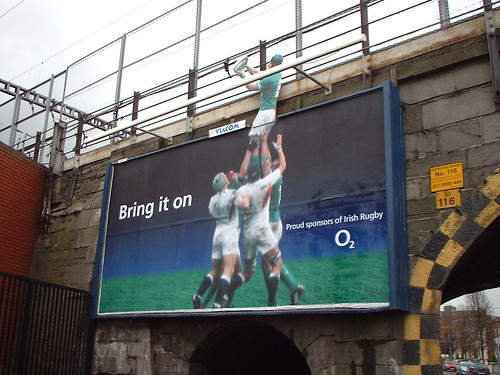
o2 here supporting the irish rugby. It still uses the shades of blue that are associated with the o2 name, and uses the simple popping out of the frame device to sell the advert. o2 like to keep things simple yet effective. theres a cool calm but reassuring theme to a lot of the adverts ive seen, not overly jokey and reasonably consistant throughout.
Chris De Vincenzo

I love the way in this image that the dress and the added effects combine to create a striking composition. Effects like these is where photoshop comes into its own.
Thursday, 23 July 2009
o2 german advert

o2 here again sticking to the colours that they tended to use across all their adverts. It has a futuristic feel, the light waves and droplike shapes brought together in a composition that really sells the futuristic o2 message. They have moved on to we're better connected now, but people still remember these sort of campaigns and the futuristic messege they gave out.
Wednesday, 22 July 2009
o2 power 2006
http://www.youtube.com/watch?v=LX4ahCJ9Y_U
This is another advert from 2006. o2 at the time where really pressing the blue and white colour scheme to their adverts to get across the branding. Later they could take those colours and people would recognise o2 just from the colours, or an oxygen bubble. This is a simple idea and has energy due to the neon light outlines that the advert uses, but visually it is repetative and boring and relys too much on the voiceover.
This is another advert from 2006. o2 at the time where really pressing the blue and white colour scheme to their adverts to get across the branding. Later they could take those colours and people would recognise o2 just from the colours, or an oxygen bubble. This is a simple idea and has energy due to the neon light outlines that the advert uses, but visually it is repetative and boring and relys too much on the voiceover.
o2 bubble advert
This is an o2 advert from 2006. It works with the oxygen bubble synonymous with the o2 brand, making up its logo. But this time it flys around a city. o2, see what you can do is the tagline. It is in a way a exercise in the slickness of the graphics. I find the advert is slightly dull except to wow people with the visual effects and camera work. The actual concept is simple and it does relate to the brand, and how it links people together, it is for brand recognision not to promote o2's products. It also assumes that you know somewhat what o2 as it doesnt mention the phone network outright in the visuals of the advert at all. It instead relys on metaphor.
sydney opera house

I really like this piece. It is cheeky yet makes you stop and think. It also reminds me of o2 campaigns and the simplicity that they aim for. This image has shown me that something can be really simple and still be effective.
Tuesday, 21 July 2009
Chuck Anderson light work

http://www.nopattern.com/nopattern/project.asp?project_ID=105
Chuck anderson is a photoshop designer that i greatly admire for his light based designs. They give off so much energy and movement in his pieces. I would hope to capture some of that energy in my o2 work. Although there has been a lot of work of this ilk recently and i can see trends moving on soon.
Monday, 20 July 2009
Rain cup

couldnt find the creator of this image as the site is in russian, but i love the use of physical objects that are then photographed in this. With a little bit of illustration and the effect is complete. Charming and simple, but effective. I will try and use different media in this o2 brief to get a wider range of media.
Sunday, 19 July 2009
o2 the brand

History of o2
O2 is a leading provider of mobile and broadband services to consumers and businesses in the UK. The company is the leader in non-voice services, including text, media messaging, games, music and video, as well as data connections via GPRS, HSDPA, 3G and WLAN.
O2 UK is part of the Telefónica O2 Europe group which comprises integrated fixed/mobile businesses in the UK, Ireland, Germany, the Czech Republic and Slovakia - all of which use 'O2' as their consumer brand. In addition, O2 has established the Tesco Mobile joint venture business in the UK and Ireland, as well as, the Tchibo Mobilfunk joint venture in Germany. O2 is a wholly-owned subsidiary of Telefónica S.A.
As at December 2007, we had more than 40 million fixed and mobile customers across Europe and 29,000 employees across the Group. O2 UK has 18.4 million customers.
O2 was formed in 2001, following the demerger from British Telecom of its former mobile business, BT Wireless.
O2 was ranked as 6th best place to work in the Best Companies to Work for 2008 List and has been awarded a three-star accreditation denoting an 'extraordinary' company.
o2 seems to stick to a dark through to light blue theme with highlights in white for most of its identity. They encourage simplicity and beauty in their promotional material. They sum themselves up with a bubble of oxygen and its a motif they use heavily in campaigns.
Subscribe to:
Posts (Atom)